nautivia.eu · Claude Code · ~110 mockups · 5 days
Spotted as Claude-made AI slop
Several people looked at the new homepage of nautivia.eu and spotted it straight away as AI slop that Claude made. They were right, and I had not seen it. This is the process that got it out of there: the tells, twenty concepts in an evening, a travel poster, a palette my wife vetoed, and a fan of app screens I loved that did not survive the phone. And the honest part: it is still hard to get to something that is beautiful, smart and easy to use.
What nautivia.eu is
One front door to the sea in Croatia. You are crossing with a vehicle, without one, or you have your own boat. The first two go to croatianferries.com (every line, the live queue at three ramps read from port cameras), the third to nautivia.app (shelter for the wind, fuel, berths, SOS). Its first job is to understand what you need in a second and send you there.
The page I thought was beautiful
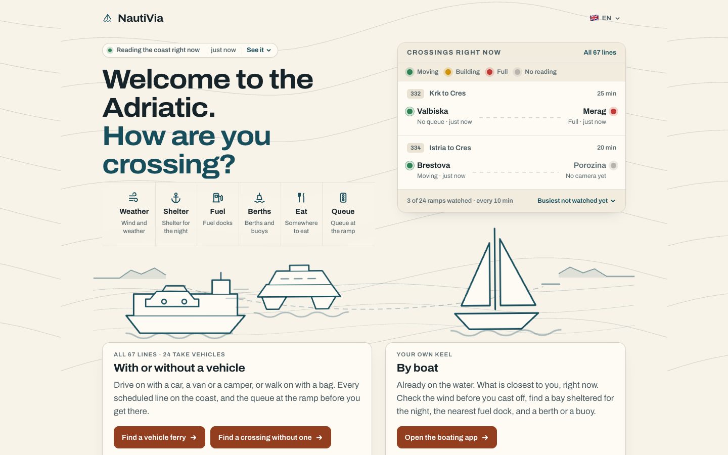
Two days before, I had written to Claude "I love the icons, the design now is beautiful". Then the feedback came in, and once you see it you cannot stop seeing it.
The tells
I asked Claude to search for what AI-made design looks like and go through my page with the list. The page had almost all of them:
- Cream background with terracotta buttons. The default "warm and tasteful" palette.
- The second line of the headline in an accent colour.
- Small uppercase letter-spaced labels over every block.
- Soft rounded cards, with twelve different corner radii across the page.
- A rounded tag with a coloured status dot.
Each one is fine alone. It is the combination people recognise, before they have read anything.
Twenty directions in one evening
The fix was not to tweak. I asked for ten completely different directions for the same content, then ten more wildly different ones, each rendered as a real page on real data and screenshotted on desktop and phone: a ramp camera as the hero, a line sheet, road signs, a nautical chart, a ticket, signal flags, a tabloid front page, a travel poster, an engine telegraph.
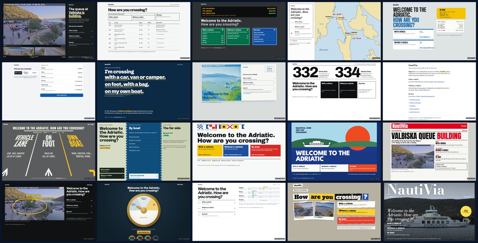
I picked four (4, 5, 11 and 14). Each got four more variants. Then I picked 14D, a 1960s travel poster, and asked for ten more around it.
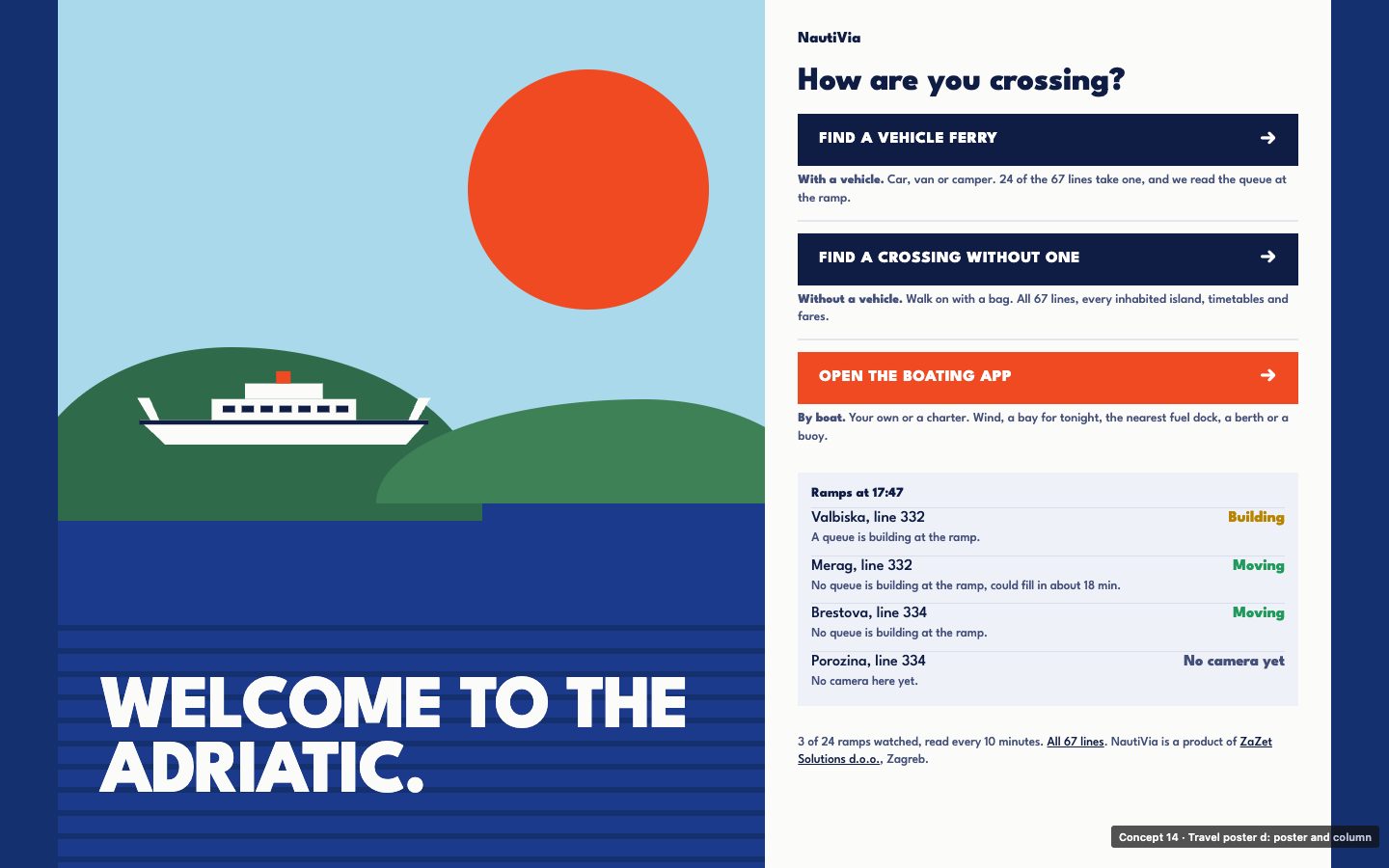
My wife thought it was too colourful. So six more palettes, and we landed on "Limestone". Then three phone layouts; "buttons on the sea" won.
The fan
The idea I loved most was mine: when you pick a boat, it sails to the middle and a fan of app screens opens around it (the shop and SOS among them), like a Spanish wind fan. On desktop it is lovely.
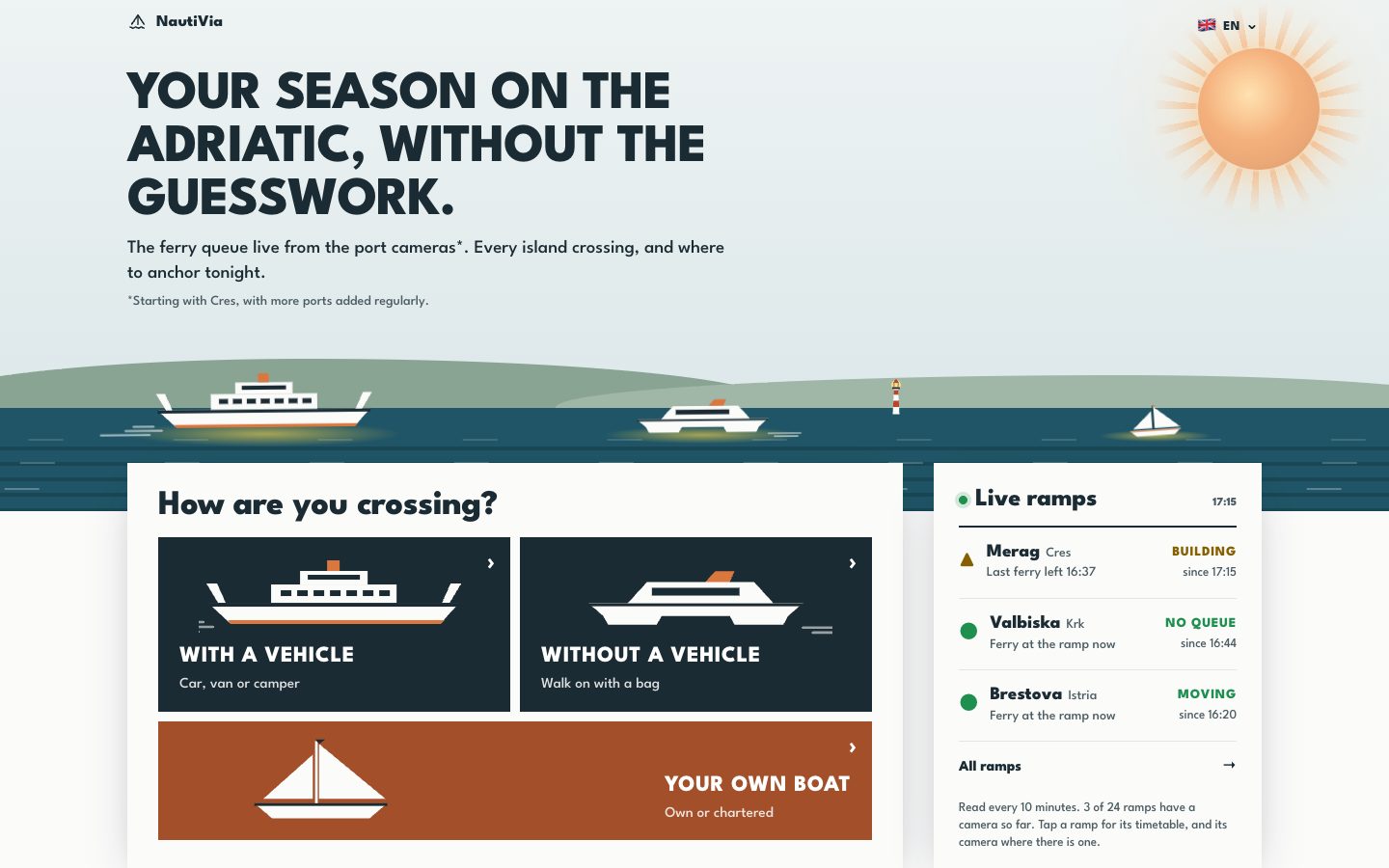
On a phone it became decision fatigue. Claude's diagnosis: the page asked two questions before it showed anything, and there were seven things to choose from. A dozen or so commits went into making the fan work on a phone: an accordion, the tapped button lifting above the drawing, a sea well under it. My own reaction on the phone was, roughly, too much is happening, it should be: I'm that, show me that, let's go. So the fan came out. The version that went live today has two doors for the ferries and the boat as an equal door, not an afterthought.
What is live now
The numbers behind it
| What | Count |
|---|---|
| Mockups, entrance + app | ~110 (hub desktop 20 + 16 + 10 + 6 palettes, hub phone 30, app 28) |
| Days | 5 calendar days from the slop message to today (25 to 29 September) |
| Design commits | ~80 (about 48 on the hub, 34 on the app) |
| Skills | Open-source skills: Impeccable, taste-skill, and Emil Kowalski's animation rules |
And the traffic, because a design is for someone. From GA4, Search Console and the app's own event log, pulled today:
- croatianferries.com, about three weeks live: 2,286 users, 3,543 sessions, an average visit of just over three minutes, 56,289 Google impressions and 495 clicks. More than half the sessions came from social networks, where I have been posting it in Facebook groups.
- nautivia.app, nine days since I started measuring: 634 sessions. The two things captains ask for most are fuel and a place to dock.
- nautivia.eu, the entrance: 360 visits, 340 of them from Israel. It is built for tourists in Croatia. So, probably mostly the friends I asked what they thought.
What I would tell myself on day one
- Ask for twenty directions before you polish one. My first page was the model's default look, and polishing it only made it a more polished default.
- Render every concept as a real page on real data, not as a description.
- Look at it on a phone before you fall in love with it.
- Getting twenty options takes an evening now. Choosing between them still took me, and my wife.
Old or new?
I am genuinely asking. Click both and tell me which one you would use, and why.